DOTS REBRANDING

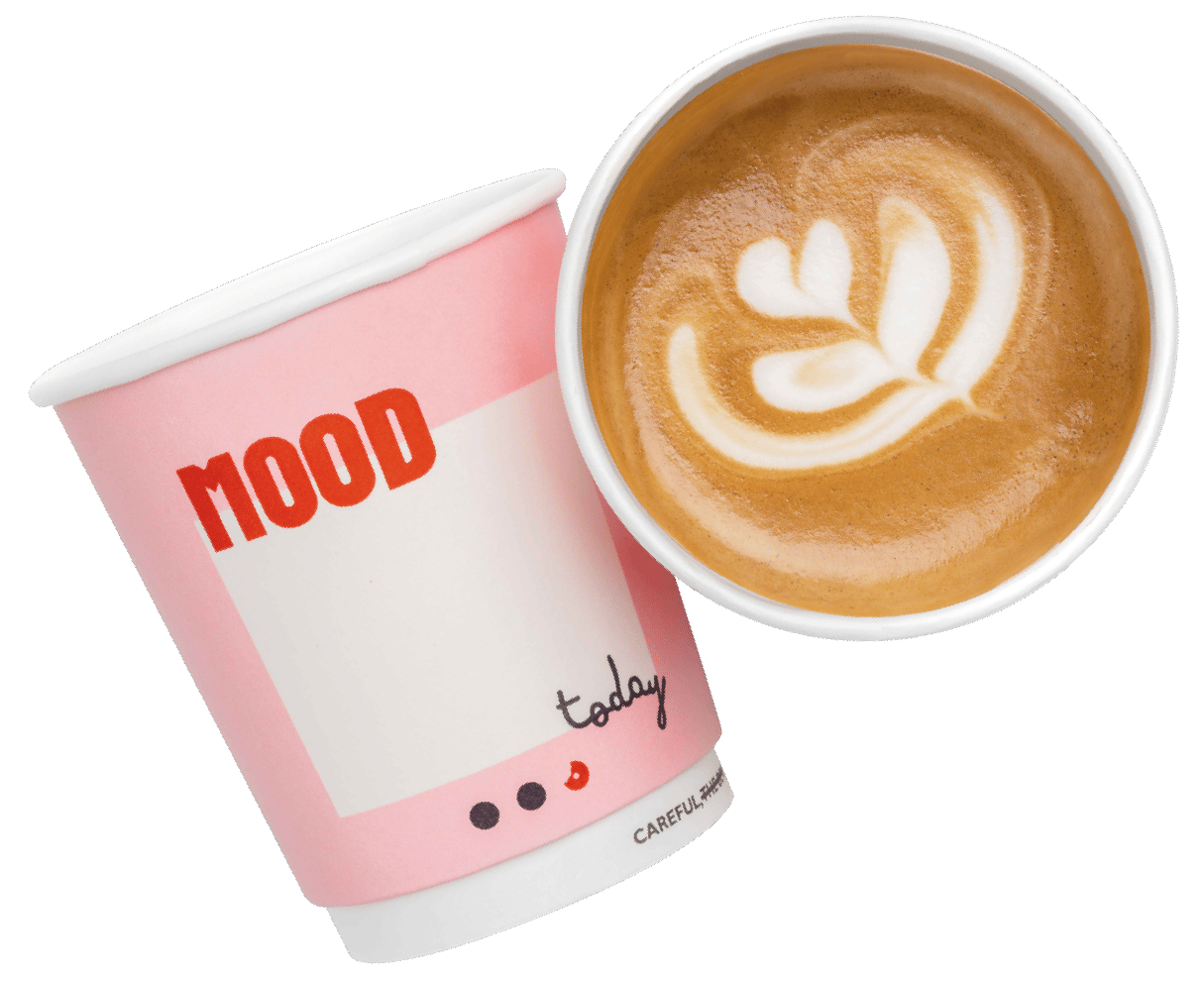
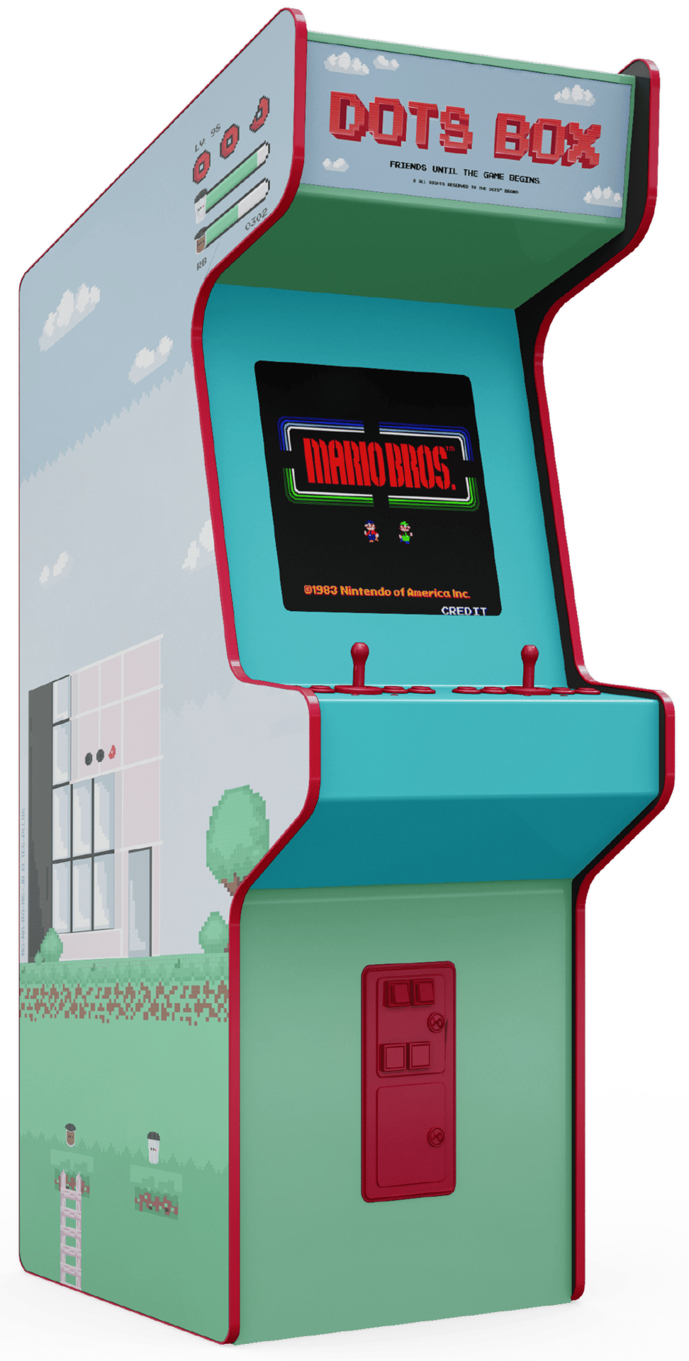
Dots has built a reputation of serving delicious, artisanal doughnuts. Originally, the Dots packaging was branded in a very straightforward manner with their logo and supporting graphics. We were tasked to rebrand Dots to be more suited to their target audience in order to push sales and increase revenue. The brand was upgraded by implementing a more exciting and approachable visual language with relatable merch, and interactive, efficient packaging. In doing so, the strategy changed how the brand was perceived and it went from being a more refined artisanal brand to a brand that’s bigger, bolder and fun loving.
Project Includes:
Rebranding, New Brand Strategy, Ideation, Comprehensive Packaging, Menu Redesign, Social Media Design, Merch Design, Hoarding Design


